Magazine cover (final)

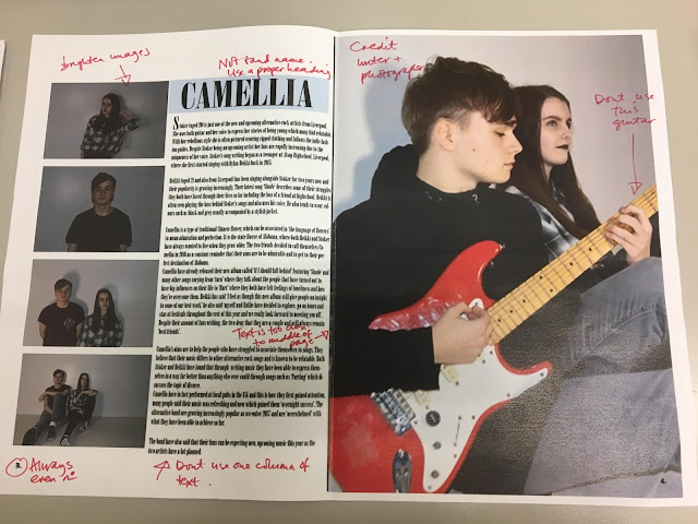
This is my final design idea for the front cover of my magazine. I really love the simplicity of the layout because it allows the audience to see all the information they might need and has a slight similarity to Clash's magazine layout and style. Although I have decided to use a white background behind the photograph to compliment the title of my magazine and what the artist is wearing. I ensured that my artist wore clothing that linked to the style of my magazine (alternative) which is why he is seen wearing a simple black top. My intentions here are to gain attention through my unique title and bold artist names. I also decided to put the duo 'Camellia' in a baby blue colour as this is their signature colour (which is seen later on within my double page spread). I also believe this might add elements of curiosity for my front cover.
Comments
Post a Comment