Original Contents

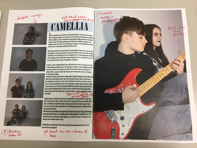
This was my original idea for my contents page, featuring blue in the top box which links to Camellia. However I decided that this wasn't really necessary and would look better with black or white box with white or black text in front of it. But I have decided to keep the idea of the text boxes as I believe they provide a nice layout and accessible structure, but I do believe that they need to be bigger so my target audience can be more informed.
Comments
Post a Comment