Posts

Showing posts from March, 2017

Question 7 Evaluation finished

Image

Front cover stages

Image

Contents stages

Image

Double page spread stages

Image

Original Contents

Image
This was my original idea for my contents page, featuring blue in the top box which links to Camellia. However I decided that this wasn't really necessary and would look better with black or white box with white or black text in front of it. But I have decided to keep the idea of the text boxes as I believe they provide a nice layout and accessible structure, but I do believe that they need to be bigger so my target audience can be more informed.  

Magazine cover 2

Image
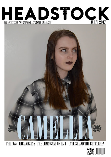
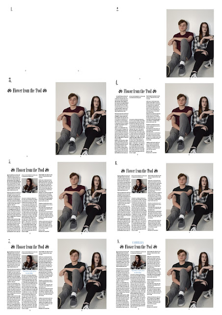
This was another option for my front cover page which I really enjoy. Again here, I thought the only problem with this cover was the colour scheme. This is because the background of this photograph is the same colour as part of 'Hallies' top-therefore it clashes. Another thing I struggled to change here was the colour of the small flower symbols which resembled a Chinese camellia flower. I attempted to change the colour of the flower to white as well as black and grey but the shape of the flower became slightly lost-which is another reason why I have decided against using this as my cover. The layout of this cover is very minimalistic, which isn't necessarily a negative but I feel as if this cover does not provide enough information in order for it to catch my audiences' eye and inform them enough. However, I love the 'Headstock' logo I have created against the white background and this is something I wish to keep for my final cover. I believe the hidden symbo

Original Magazine cover 1 (draft)

Image
I have decided against using this as my official magazine cover. This is because I believe that the mise-en-scene within the photograph does not match my music style (alternative). Also due to the fact that I felt the font for 'Camellia' wasn't really as appealing as it could have been. Despite the fact that both members of the duo (Camellia) star on the front cover, I had been suggested to try two covers-one featuring 'Hallie Stoker' (pictured to the right) and Dylan Heikki (pictured to the left). This was to see who'd fit the front cover of my alternative magazine more appropriately and I do believe it was more successful as a cover. Another thing about this cover, is that the white against 'Hallie Stokers' top blends in and makes it difficult to see the band names. It is also my opinion that  I could have chose a more fitting photograph to feature on the front page of my magazine as both 'Hallie' and 'Dylan' seem to look quite indiv

Original double page spread (draft)

Image
Original double page spread Above is an image of my original double page spread and the feedback surrounding it. As you can see my double page spread has changed quite a large amount, as I have decided to use two photo's instead of five; added symbolic symbols; changed the format of the layout and the columns of text. This is because I believed that I could change the layout further- still making it engaging but spreading the text columns wider as I was suggested to do.  However, I did decide to keep the layout of having a large photograph on the opposite page as I've seen this used within magazines such as Clash magazine and believe that it is very effective- despite the fact it is simple and minimal. In my opinion, this fits well with the structure of my magazine as it is very minimalistic. I also decided to brighten my images as from my feedback I gathered that they were quite dark which could create a