Audience feedback on flat plans
Flat Plan-Double Page Spread:
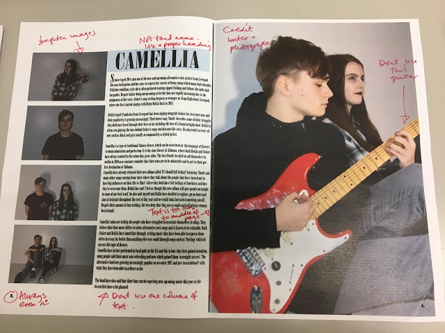
Firstly I really like how you have included the name of your magazine at the top of the double page spread as this creates a nice link across the magazine. I like how you have chosen to use three images on your double page spread as I feel this would look eye catching and interesting to audiences, however another idea that may work would be having the image take over the whole of the right hand side of the page. Due to the text lines being different lengths on your flat plan this would make the text look more interesting on the page and would also encourage readers to read the article.
Contents:
I really like the idea of having three images on the page as this will help to break up the text and look attractive to audiences. Having different sized images on the page will also create differentiation for audiences which will appeal to them as well. By having the text in columns the text will be easy to read and look well organised on the page. To improve slightly you could possibly make your flat plans more detailed however the ideas are very good and follow magazine conventions.
Cover:
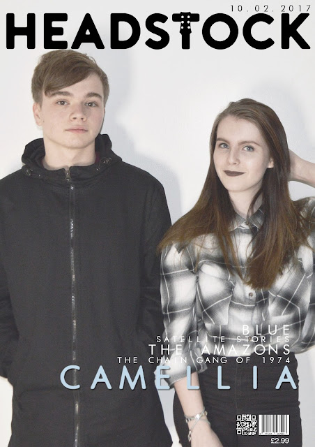
I like the name Headstock as this is quirky and unique fitting to your genre well. Having a mid-shot as your main image is good as this will attract audiences to your magazine as well as this fitting to magazine conventions and critics. I like how you plan to organise the different information on the right hand side and how you plan to use different fonts and font sizes to do this, as I feel this will attract audiences to the cover page.


Comments
Post a Comment