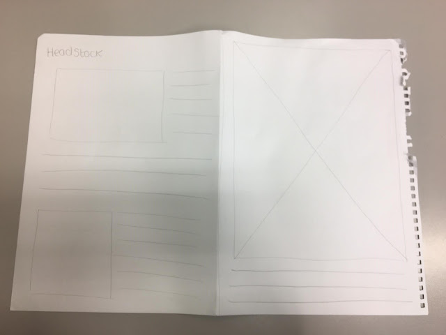
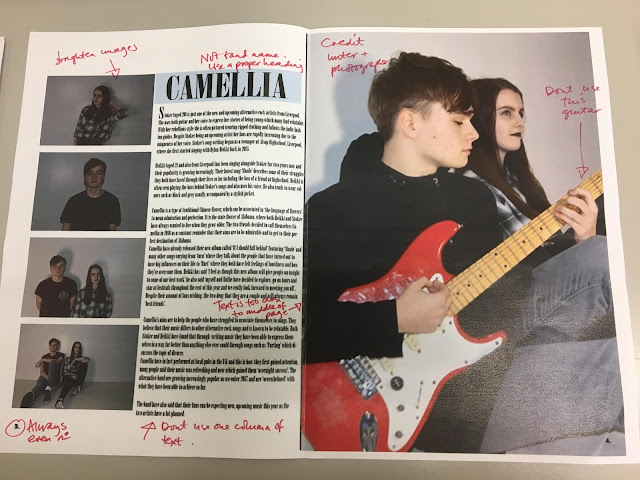
Double page spread flat plan
My ideas behind this flat plan was to keep with the simplistic idea of layout. I knew that simplistic layouts are never overrated and people tend to find them a lot easier to read than a complex layout. I wanted to display the title of my magazine again in my double page spread because I believed it provided a nice illustration for my magazine, however looking back now I believe I will need a subtitle. I wanted to use a single large image on the right page because I believe that would also provide the audience with some nice illustration. Another thing I think I will decide to change is the way the text is positioned, I believe that it should in fact be in columns so it resembles more of a realistic magazine.


Comments
Post a Comment