Double page spread (final)

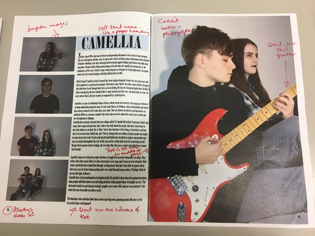
My idea behind this double page spread was influenced by one of many of Clash's magazine layouts-which feature a large photograph to the right of the page and to the left is often a coloured background or small photo. I then decided to display 'Camellia' in baby blue font as this is their signature colour and I believed it allowed the duo's name to come across as highlighted on this double page spread. I used symbols resembling a Chinese Camellia flower to provide my target audience with some imagery of this Chinese flower (within my article it explains what this is).

Comments
Post a Comment