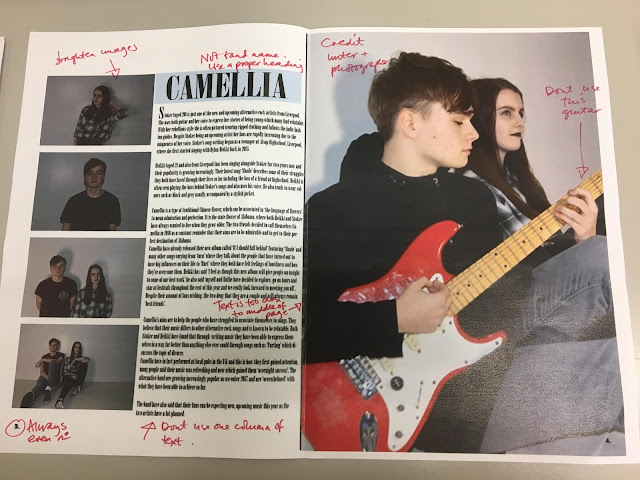
Original double page spread Above is an image of my original double page spread and the feedback surrounding it. As you can see my double page spread has changed quite a large amount, as I have decided to use two photo's instead of five; added symbolic symbols; changed the format of the layout and the columns of text. This is because I believed that I could change the layout further- still making it engaging but spreading the text columns wider as I was suggested to do. However, I did decide to keep the layout of having a large photograph on the opposite page as I've seen this used within magazines such as Clash magazine and believe that it is very effective- despite the fact it is simple and minimal. In my opinion, this fits well with the structure of my magazine as it is very minimalistic. I also decided to brighten my images as from my feedback I gathered that they were quite dark...

Comments
Post a Comment