Audience feedback on drafts
Audience feedback from student Stephanie Colderick aged 17
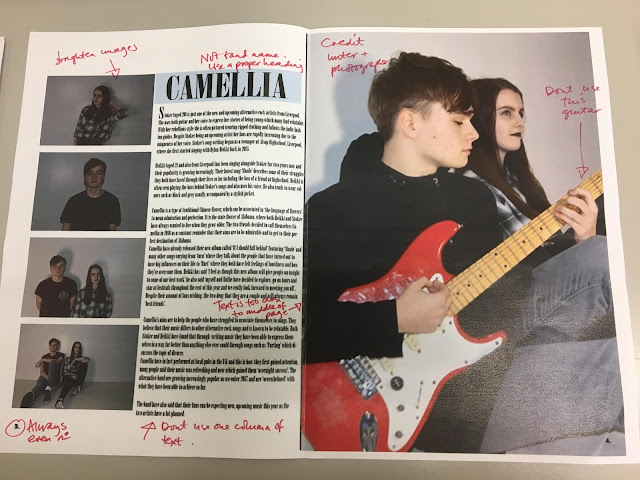
Draft-Double Page Spread
I really like the images used within the double page spread and feel the styling of the two models works really well to make them look like an effective and genuine duo. The main image on the right hand side of the page is effective and I like how this takes up the whole page, however I feel that the guitar especially the colour of the guitar is very different to the theme of the double page spread. The use of the light blue colour is effective in adding to the sleek black and white colour scheme and I feel to improve slightly you could possibly use this colour more especially throughout the rest of the page. Your clear margins and guidelines really give the page a professional look and feel which is enhanced by the good quality photos. I really like the font chosen and feel this matches your magazine genre well, however maybe more of the article could feature on the page which could be achieved by possibly having less images on the left hand side of page.
Cover:
I really like how you have used a larger image for your contents as I feel this looks unique and is effective in drawing attention to your magazine. The use of the colour blue is very effective on this page, just enough to be eye catching and not too much to be overpowering. I like how you put the title of the magazine on the contents page as this creates a good link throughout the magazine. The text is really well organised into boxes which makes it easy to read and understand. To improve you could try to minimize the amount of blank space on the page as this could be seen as making the page look empty.
Contents:
I really like the use of a mid-shot for the duo who are styled very well and look very effective. The font used for the masthead with the guitar feature is very effective in showing the genre of your magazine and attracting audiences to the cover page. I like the date at the top on the right hand side and this is common feature of magazines, helping your magazine to look realistic. The use of the colour blue is again very effective however the white paired with the blue dose slightly fade into the background making this harder to read. To improve you could try changing the colour of the text. Another small improvement would to either have both the models looking more natural (like the boy) or more posed (like the girl) as this would help to bring the image together more. I really like how you have included two different barcodes as this a modern addition to most magazines.

Comments
Post a Comment