Audience response about drafts
Drafts
Cover
I like this cover page as all of the colours work together really well. However, the image is very faded and I don’t feel suits the rest of your magazine so it may be worth considering swapping your image. I am also finding a few of the artist names hard to read as they are written in white over a partly white top so it may be worth changing the text colour or moving the text if you decide to not change your image. The magazine name is good and thought out and I can see the link with music which will encourage the readers to buy the magazine. Other than that, I like the layout of this cover page and with a few adjustments will be really eye catching for your target audience.
Contents
I really like the colour scheme for your contents page as it is very different to what is typically seen on a music magazine so it will stand out. The patterned background behind the model is intriguing and I like how the text is laid out in clearly organised boxes. I would suggest to change your font under the headings as I am personally finding it very hard and straining to read.
Double Page Spread
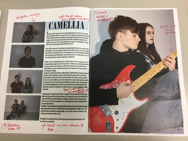
I like how you have a lot of images on here but I would suggest to make the images brighter so they will stand out more and the artist will have a more impacting effect on the reader. I like how you’ve given Camilla a logo continuing the blue theme throughout your magazine which shows continuality. I would suggest using two columns as text unless the unconventional approach is what you wanted as one column is not generally seen in magazines as it appears there is a lot of writing.
Comments
Post a Comment